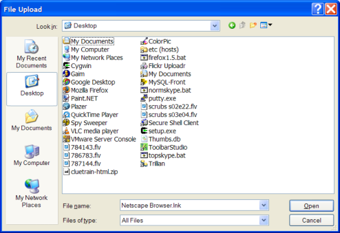
I hate the “Open File” dialog box. I hate it as well as it’s bastard cousin, the “File Save” box.

I just spent 15 minutes on the phone trying to walk my Dad through the process of attaching a file to his Gmail message. All of the problems came from this little box. It’s a world unto itself, totally different from the normal way that we see files or navigate files.
Novice users like my Dad don’t understand that these little boxes have their own idea of location. (My dad exclaims: “What do you mean I have to navigate to the desktop? I see the file on the desktop right there!”) And power users like myself are frustrated the boxes don’t do basic features like remembering your view preferences or having any sort of bookmarking. Every day I repeat the same navigation steps at least 100 times.
This dialog has sucked for over 10 years now. I’m not sure what it would be, but I suspect it would be more like Google and less like Windows 3.1. Can someone come up with a better solution? Please?
That’s my rant.
(And belated Happy Thanksgiving everyone! Thanks for reading.)
Man, the open file dialog. Among the awful pieces of the disgusting operating system called XP, one of the worst, and unfortunately one that can’t be fixed (or can it?) by add-ons and alternative programs. I think there will be an alternative for the whole files-and-folders-in-a-tree way of representing data on the hard disk in the future. By the way, I also think that this problem hinges on our whole idea of identity of data and its various representations on digital media.
good point…yea, there needs to be something. Maybe even the option to navigate directly to a file using C:\WINDOWS\system32\etc…\etc…\etc… similar to what you would do in IE’s Location Bar.
Then again, for all that matter, if you are troubleshooting a less-tech-saavy user, you could just have them type the address/file location to the Start > Run dialog box.
But yea, that wouldn’t help much for your dad who was trying to navigate to a file on his desktop, to attach to a gmail message…hehehe.
Who knows, maybe this could be something GOOGLE should look into? Allow users to paste path locations into the body of the e-mail, to attach a file, and thus bypassing that Open/Save dialog box.
I do gotta give MS props though, they added the toolbox thing on the side to navigate to the Desktop/My Documents/etc…but IMHO, it wouldn’t hurt if those buttons were smaller, and allowed for more “items” in the list. But I think for most people, Desktop, My Documents, and Recent Documents is good enough?
I feel many of the problems with the open and save dialogs belong with the applications that use them. Too often, they open to default locations like My Documents, when they should remember the previous location from the last time the application was run.
There’s nothing more annoying than having to repeatedly navigate to the same folder to open a file every time you run a program. Sloppy, careless, programming…