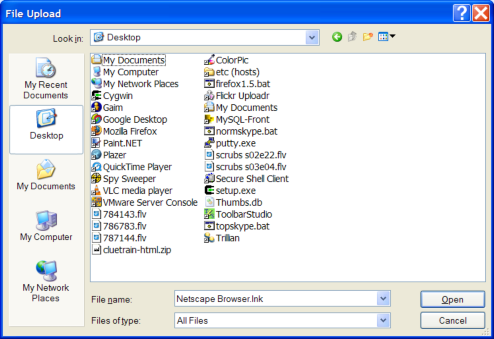
I hate the “Open File” dialog box. I hate it as well as it’s bastard cousin, the “File Save” box.
I just spent 15 minutes on the phone trying to walk my Dad through the process of attaching a file to his Gmail message. All of the problems came from this little box. It’s a world unto itself, totally different from the normal way that we see files or navigate files.
Novice users like my Dad don’t understand that these little boxes have their own idea of location. (My dad exclaims: “What do you mean I have to navigate to the desktop? I see the file on the desktop right there!”) And power users like myself are frustrated the boxes don’t do basic features like remembering your view preferences or having any sort of bookmarking. Every day I repeat the same navigation steps at least 100 times.
This dialog has sucked for over 10 years now. I’m not sure what it would be, but I suspect it would be more like Google and less like Windows 3.1. Can someone come up with a better solution? Please?
That’s my rant.
(And belated Happy Thanksgiving everyone! Thanks for reading.)