In August 2008 my old laptop bit the dust. Everyone was raving about Macs and I saw some good developers using them. This, and the fact I was such an Apple fanboy in my youth, convinced me that it was time for this prodigal Mac son to come home. I bought an almost-new MacBook off Craigslist–which later turned out to be stolen. But that’s another story. (But interesting to note that New York police aren’t interested if you call tell them you think you have a stolen laptop.) I was immediately disappointed. And as I now knew it was hot, I couldn’t in good conscience resell it.
So for the past year I’ve kept a list where I express my frustration every time it slows me down. At the behest of many, I now present that list. (Please note that this list is compiled from moments of extreme frustration over many months. I’m generally a happy person!)
Overall User Interface
1. The menu bar on the Mac makes no sense. It is based on 1984 technology when only one program ran at a time, so every window on the screen belonged to the same program. This approach is ridiculous today when it’s not uncommon to have 15 or more programs running at once, each with several windows, spread across a multiple monitors. For example, I keep Skype and Adium windows open on the far right of my external monitor. To edit a Skype setting, I must navigate to the opposite side of the desktop, across two entire screen widths, just to reach a menu option.
For example, consider how Apple might improve a basic kitchen setup, where they’ve heard complaints of people not knowing where to find controls for their appliances.

That’s right: the controls for every kitchen appliance should really be in one place –no matter how far from the actual appliance– so that people always know where to find them!
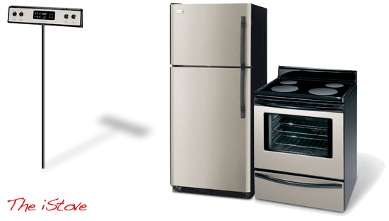
(It’s hard to tell in this picture, but those dials are actually changing the microwave (to left of the picture), since thats the last appliance the chef touched. A small line of 12-point text explains which appliance is currently being controlled. It’s so intuitive, and the extra steps to walk across the kitchen are a small price to pay for always knowing where your controls are!)
2. Menu actions take effect on the “topmost” window of an application, but in an age of multiple screens, this is often ambiguous. If I have two screens, and each screen has a window sitting on top, which window is the one I’m operating on?
3. Ghost programs. Program can be running but with no windows, existing only as menu bar. Furthermore, when no windows for an app are open, you get the nonsense situation where many menu actions (E.g. “New Folder” in finder) make no sense at all.
4. Confusing situations when menu bar of window-less app is showing over window of other program. The natural instinct is to think that the menu bar relates to the window which is filling the screen, but the interface leads you astray.
5. No copy-n-paste from calculator widget or dictionary, or any widgets. Just today I needed to calculate the number of seconds in 2 years. It was easy to do use the Mac calculator and even get the answer: 63,072,000. But it is impossible to copy that answer into my file. Not only that, but it is also impossible to look at the calculator to transcribe the answer! The only solution is to write the answer down with a pen, or two flip back and forth to insure you remembered it correctly. Glad to have a $2K laptop for this. (See here for more info)
6. Undraggable. It is impossible to drag something (like a file from Finder) to an application which is not currently visible. You must carefully arrange windows ahead of time so that both are visible. In Windows. you can drag to a program in the task bar, which then will bring that application window to the front. (Furthermore, in Windows when you drag to the task bar, you can even select from multiple windows of the application.)
7. The only hint that application is running is a few glowing pixels below it.
8. Impossible to perform a double-click and drag (or triple-click and drag) from the touchpad without using the button.
9. No Home or End Keys on Keyboard. Now before you start screaming about using Command-left and Command-right, simmer down and listen for second. The problem is these combinations don’t always work as Home/End, and this inconsistency is enough to make them useless. E.g. in Firefox, Command-left/right are also the shortcuts for navigating forward back/back pages. In Entourage Command-left/right means to jump forward or back by a word, not the entire line. In Terminal Command-left/right means to switch between windows. In Adium Command-left/right switches between Tabs. And in Google Docs, those key combinations don’t do anything at all. It is up to every program to decide if they will offer this super-duper feature, and to decide what key combination to assign. In Entourage, it’s Function-left/right. In the built-in Terminal program, you can only use the oh-so-intuitive Ctrl-A or Ctrl-E.
10. Lack of error reporting overall. E.g. No way to know when you have mis-configured exchange in address book and iSync. If you do enter password or any setting wrong, it just does nothing.
11. Multiple confusing ways of installing applications. Disk images, install programs, disk images with “drag this” instruction pages, install programs on disk images, Stuffit archives, Stuffit archives of installers, and god knows how many other permutations. All I know is that I always end up with disk images left over all over the place. And by the way, it is not at all intuitive that within a “disk image” you should have to drag one icon (“the app”) to another icon (“applications”) in order to install a program on your laptop. Sometime try explaining this technique to your parents or a non-technical peer sometime.
12. Can’t navigate buttons in dialog box with arrow keys (e.g. switching between “ok” and “cancel”) CORRECTION: You can, but have to turn this option on. (Learn how here.)
13. Can’t access dialog elements with keyboard shortcuts. Must use the Mouse or Tab-Tab-Tab-Tab-Tab-Tab-Tab-Tab-Tab-Tab-Tab-Tab to get around. Ridiculously slow way of navigating complex dialog boxes that you must use often. (E.g. The Find/Replace box in Eclipse.) In contrast, Windows dialogs may be quickly navigated by pressing Alt in combination of the underlined letter of the field.
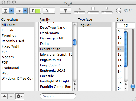
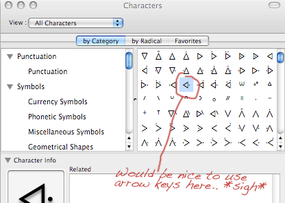
14. Many (most?) lists cannot be navigated with arrow keys. Again you are forced to use the damn mouse for a task where keys are much better. The frustrating thing here is that works in some applications.
Want to go through a list of 500 fonts? Yep, you gotta click on each one in turn, and don’t forget to play with the little scroll bar to move new items into view. Ugh.
15. No auto-resize of columns. You can’t double-click a heading divider boundary (e.g. in a list of files) to have it expand to show all items. E.g. in Finder when a column is too narrow, you should be able to double-click the column divider which expands it big enough to show all data in the rows. In Mac you have to drag the column manually, which sometime means also having to re-size the window first. It should also remember the size when you change it.
16. Lack of OK and Cancel buttons in preference boxes. No way to undo when you know you messed up some setting but don’t remember how it was. For example, when I was midway through changing email settings and then realized I was editing the wrong account. Oops! No way to get back the values I’d changed. And in any case, merely clicking the close button just feels wrong, and trains people the wrong way. (This is not the right behavior when editing a spreadsheet or document, for example!)
18. Minimizing creates confusing flow. Minimizing window takes it completely out of alt-tab cycle. it appears only unreadable thumbnail. No way to minimize a window just to see window below. More on this later.
19. No universal keyboard shortcuts. Every menu bar option in Windows interface is accessible via the Alt key. On Mac, if menu has no defined keyboard shortcut, you’re SOL unless you take the time to manually add one. Correction: It is possible (learned about it here), but combination is l-o-n-g: FN-CNTRL-F2, letters of menu, down-arrow, letters of command, ENTER. For example, in Firefox let’s set the Zoom option to “text only”:
- Windows: ALT-V, Z, T
- Mac: CTRL-FUNCTION-F2, V, ENTER, Z, ENTER, DOWN, DOWN, DOWN, ENTER.
20. Font bluring is lame. Kindofa preference, but small fonts are still more readable under windows. MS smooths fonts to pixel boundaries, so small fonts look readable. No luck on mac. See here and here.
21. Zoom/Maximize button is absolutely ridiculous, as is the whole stoplight analogy. In iTunes, the “+” button actaully shrinks the window. In Finder, the behaviour is completely random, other programs expand to only most of the screen. This is a long-standing problem that many have complained about.
22. Confusing situation with programs that exist only as icons on menu bar. E.g. Mozy: Sometimes it shows a modal dialog box, but this box doesn’t show up in the Command-tab flow, nor does it show up in Exposé. And yet, the program is halted (and all menu items disabled) waiting for my response. For months I thought the program had crashed and force-killed it. One day with relatively few programs running I accidentally noticed the dialog box hiding there under all the other windows.
23. Dialog boxes lose focus all the time, and you never see them. For example, when creating account on iTunes with Firefox, the “launch app” window gets hidden by default.
Browser
24. No icons for shortcuts in browser. Note that they actually removed this feature. I thought macs were about being graphical? Back in 1984 Apple was explaining “icons” to the world and how useful they were. But now they’ve decided that shiny interfaces look better without your icons messing it up the vibe. You’re stuck with text.
Here is my browser toolbar in Windows:

And here it is on the Mac:

Instead of 19 shortcuts that I can identify immediately from an icon, I have 9 shortcuts that I have to parse as text. Blah. (Happy to note that Google Chrome for Mac, released for Mac last week, does show icons.)
25. Strange browser tab UI: why does the tab connect upward to the favorites bar? This makes no physical sense.
Call me old fashioned, but I have seen actual physical folders existing in the real world. Yes they do exist. And in my memory, they look something like the image below. Observe the fine detail of how the folder title is connected to the folder itself.

Apple engineers are smart, but I think they remember folders working a little differently than I do. Or perhaps they grew up somewhere that used a different kind of folders? Ones that looked more like this, perhaps:

For example, here’s how tabs are shown in Safari:
(Again, Google Chrome for Mac gets this right.)
Finder and Files
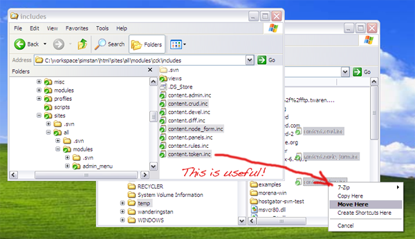
26. No option to Cut files in Finder, only Copy. A pain when trying to move a large number of hand-picked files to a new location. Again, you’re forced to mess with the mouse and multiple windows and dragging: the only way to copy files is to open and strategically arrange two finder instances. And really, why did they bother to implement “Copy” if they had no intention to implement Cut?
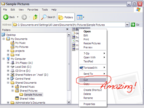
27. Renaming files only possible from time-consuming mouse gesture. “Rename” is not a possible action from the right-click menu. Nor is there any keyboard shortcut. Nor is there a menu option. Nor is there an entry in a help file somewhere. One must just know that the correct action is “click-once and wait 2 seconds”.
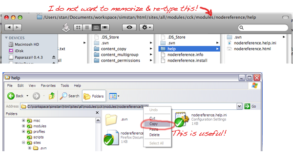
28. No* way to copy-n-paste your current path. So frustrating when you can see it in window title! (This guy is amazed to discover that this is useful )
*Correction! It can be done by following these simple steps:
- Select a file
- Go to finder menu
- Select “services” submenu
- Now select “textedit” submenu
- Now select “New window containing selection”
- Wait this for app to load
- Press Command-A to select-all
- Press Command-C to copy
- Close the textedit application.
- And now you have the path copied! Wasnt’ that easy and fun?!
As a general note, on the Mac I find myself writing down or trying to memorize long paths all the frickin time. So sick of this.
29. Mac Laptops cannot perform a right-click-and-drag, as they have no physical right button. (In Windows explorer, this allows you to drag files and then specify whether they will be copied or moved. Other programs use right-drag in other ways.)
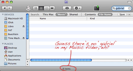
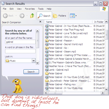
30. Can’t search external drives. I have an external hard disk with many gigabytes of music in a folder called “Music”, sorted into many subfolders. I plug it in, try to do a search for “gabriel”. But guess what? I ask the impossible!! Yep, this powerful Mac can only look for files that it has pre-indexed. How friggin retarded is this? Earth to Apple: finding files should not be a problem for a GUI in the 21st century. (Note: some have suggested that this is because the drive was formatted for Fat32. But (1) that’s still no excuse for inability to do a simple file search and (2) if that is so, a message saying “I can’t do that” would be preferable to saying “Zero items found.”)
31. “Move to Trash” is confusing. First word of menu is “move”, and “moving” files is not what you’re thinking of. Minor, but annoying.
32. Right click doesn’t show all available options available on the target. You just have to know that some things are in the right click menu, some things you have to find in the menu bar, and some things are only available as mouse gestures.
33. Cannot permanently delete an individual file. (See this applescript hack.) In Windows this magical feat is accomplished by holding the Shift key while deleting. (See here)
34. Can’t right-click file to email it. Not even a menu option. You must open a mail program, and navigate the file system to re-find the file which you have sitting right there in front of you.
35. Can’t right-click file to print it. Not even a menu option. Again.
35. Apple’s Mail Application is always default for sending mail. Preview has a handy menu item, “Mail Image.” Too bad Apple decided that the only mail application you can use is their own built-in Mail. Thanks Apple! Even more bizarre, Apple does let you change your default email reader. (See here) So, you may read emails in any app you like, but you are expected to send all your email from Apple’s. Great. Awe-some. (Microsoft pulls this kind of crap too, of course. But for at least the last five years you’ve been able to change your default email program.)
36. No shell extensions. Finder has only a few feeble means to be extended, so there is nothing like Tortoise, or “open-command-line here”, or resize images, or 7zip compression.
37. Impossible to move mp3s from Documents to Music folder. Finder always wants to copy. No way to force it to just move, without going to command line.
Open/Save Dialogs
38. Open/Save Dialogs suck big time. From an Open/Save dialog, you can’t re-name an incorrectly named new folder, or move an incorrectly placed new folder. One wrong bit of typing, and the only way to fix it is (yet again) to open a finder window and navigate your way through the file system back to where you already are in the dialog.
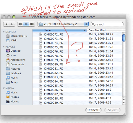
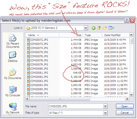
39. Can’t add columns of info when opening files. E.g. when trying to upload photos to WordPress, the “Open File” dialog box shows only “Name” and “Last Modified”, but what I really need to know is the size of each file. However, there is no way to show this information. Only way is to select “Get Info…” on each and every file. One. At. A. Time. Argh! Other useful categories include “Date Created”, “Resolution”, “Song Length”, etc… (And of course, there is also no way to jump from the dialog to Finder, as a simple “Explore Here” option in Windows will do.) See here.
40. Doesn’t remember your selected files when switching views. For example, in Icon mode you start Command-clicking a few thumbnails of files to upload. Then you need to switch to list view to check a date. (See above.) Well, thank goodness that clicking lots of little file names is so much fun, because after switching views you get to do it all over again! Hope you remembered them all!!
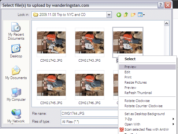
41. Can’t perform common operations in a dialog. For example, to preview or resize images before uploading, or compress large files before emailing, or rename, whatever…
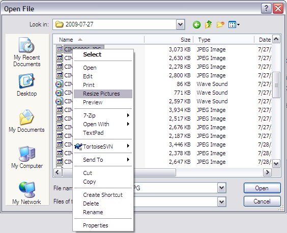
Look at what happens when you right-click a file in an Open/Save dialog in Windows:
Behold! The amazing ability to manipulate files when you see them! And lo, even to rename, compress, or re-size them as needed before emailing. Behold! The amazing ability to see the sizes of more than one file at a time! What terrible genius dwells in Redmond that gives Windows XP such truly awesome and fearful powers?!
42. Not extensible, e.g. no revision information. Mac does not allow extension of how files are represented, which means tools like Tortoise simply cannot exist. If you’ve never used it, you don’t know how much time you’ve wasted by not seeing at-a-glance which files have been changed in your repository from any program, not just an IDE.
For example, if I’m editing some images in Photoshop or whatever, I wonder which one of these files has been modified since the last commit?
In Windows the task is a teensy bit easier, as you can see.
The main point is not so much to sing the praises of Tortoise (which is a great program) put to point out that Mac OSX cannot be improved, cannot have better tools, since it cannot extended.
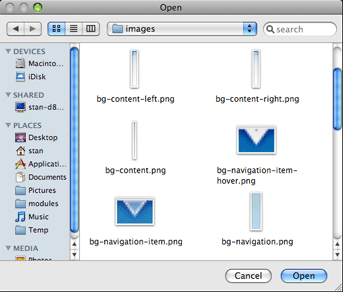
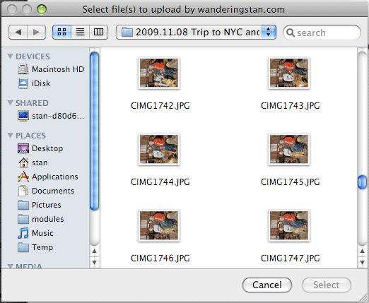
43. Thumbnails are tiny, and no way to preview at full size; the tiny icon thumbnails are tiny and un-reiszable and only can be seen in impractible icon view. Nor can you right-click to preview the file. (See below.) For good measure, Files can only be viewed in alphabetical order when you are in icon view.
Quick: Can you spot which of these thumbnails is different?
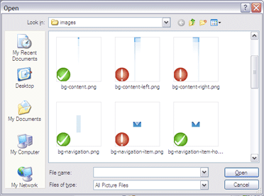
Here is the same dialog box in Windows. Woa, look at the size of those thumbnails!! It’s like you might actually be able to see what’s in the picture. And lo and behold, what’s that?? With a mere right-click, you can actually preview the image full-size if you like. Or rotate it, or resize it. All this, and you don’t even have to write down the path on a scrap of paper so you can re-navigate to the file in Photoshop.
And speaking of Photoshop. Is it any wonder that Adobe ditches the usual Mac open/save dialog box and replaces it with it’s own, which looks remarkably like Windows?
44. Impossible to open hidden files from an “open file” dialog box. For example, today in an emergency I needed to upload a “.htaccess” file via a web interface. It was impossible to so. The time-consuming workaround was to rename the file locally to remove the ‘.’, uploading it, then renaming it back both locally and on the server. Ugh. See full description here. (And again, it is impossible to rename the file from within the upload window, so I had to open an instance of Finder and re-navigate to the obscure directory that I was currently working in.)
45. Interface inconsistencies. Hitting “Enter” to open a file works in an “Open” dialog box, but not in Finder where opening is “Command-O” and enter means “Rename”.
46. When typing file name in “Save Dialog”, it doesn’t auto-complete with existing filenames. Sucks when you have a long file naming pattern that you want followed. (E.g. printing PDF’s of everything for my Berlin Trip.)
Applications and Windows
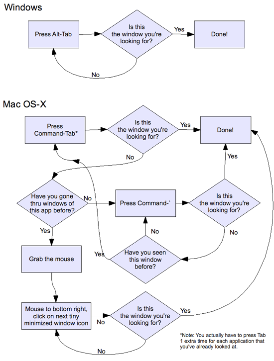
47. Alt-tab only goes through applications, not windows. This small difference makes a huge negative impact on power users. Takes longer and is more complicated to find an old window that you need. To illustrate, I mapped out the routine that I and other power users go through hundreds of times a day: Switching from one window to another using the keyboard.
48. Alt-` has behavior that is completely different from Command-Tab: Alt-` is used to switch to windows within an application. However, instead of returning to the last window used (as Command-Tab does with applications), it cycles through all windows in order. So if you have 20 windows open in an app (not unheard of to have that many open in preview or terminal) then you would have to hit Alt-` 19 times to get back to the window you were just on! Just today I was trying to copy bits of a webpage in one browser window into a blog compostion in another window. Unlucky for me, I had 5 other browser windows open. So each back-and-forth required hitting Alt-` 5 times, and running completely counter to Command-Tab behavior we’re all accustomed to.
49. Alt-` brings all other windows to the front. E.g. in phpMyAdmin, trying to cycle between an “Edit SQL” window and the underlying results (so you can compare your query and the results side by side) is impossible if you have any other brower windows open. (Same thing when in Entourage you’re trying to keep the main window open in background while edited an email — impossible if you have any other email windows floating around, because they always come to the top also when you hit Alt-`)
50. Weird side effects with unwanted windows coming to the top. E.g. if multiple terminal windows are open, and you need to read info in browser while typing in ONE of them, all of them will appear, covering your browser. Example: In browser, click to download a pdf file or something. It loads in preview, you take a look, and then you close it. Of course, you’d exepect to be back in the browser where you were. But no! Because now that you are in Preview, all the other random preview windows have now come to the top. Confusing! It’s as if you’re working in the kitchen and take out a screwdriver to fix a loose door, but when you set the screwdriver down, suddenly you are surrounded by everything from the garage that you recently used a screwdriver on.
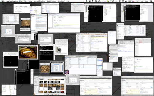
51. Exposé is not a substitute. A lot of Mac people don’t get this, so let me say it again: If you are working fast, you do not want to mess with a mouse. And if you are really doing a lot of work, you’re going to have a ton of windows open and then they all look the same. Can you tell the difference between a pdf, Word, and blog version of the same document at this scale?
52. Tools like Wich try to cover this limitation, but bog down if you have too many windows. (Wich would slow to 5-10 seconds when tabbing between 20 windows.)
Missing Tools
53. No Tortoise. SCplugin is nowhere close. And the true lack of shell extensions means that it can *never* work in Open/Save dialogs like Tortoise does.
54. No good NetDrive equivalent. (Mapping FTP to the file system.) MacFusion is buggy as hell, and even when working, takes several *minutes* to work on folders with sizable number of files.
Physical Defects
55. Always plays the startup sound even if volume was turned off and *even if headphones are plugged in*. In other words if you have to re-start your laptop while in a meeting, there is NO WAY to avoid blasting the room with that sound and looking like an idiot.
56. Bad ergonomics of Macbook: keyboard too close to screen, too far from front edge. This puts sharp corner of edge directly on the wrist.
57. Limited Screen Tilt. Screen only reclines to about a 60 degree angle. Thus making it impossible for even slightly tallish people to ergonomically position their hands at the keyboard without hunching their back to view the screen. (Elbows should be bent nearly at 90 degrees, with forearms level to the floor. See here. )
58.Keyboard and surface are completely flat so very uncomfortable to type on with sharp edges that your wrist rests on. (I guess this is why so many mac users use those little tilt gadgets to increase the angle?)
59. Goddam a MacBook Pro gets hot! Could burn my left knee to a crisp.
60. No equivalent of right-click key on keyboard. (Windows has a key on right side of space bar.) Again, you are always forced back to the mouse, slowing you down.
Misc
61. No key combo that will quit any application as Alt-F4 does in Windows.
63. With trackpad, cannot select by word. Correction you can but it only works in some programs. E.g. works in Safari but not Firefox.
64. Most programs that have a Mac version, it is incredibly crippled or behind in features. Picasa doesn’t have Geotagging, Mozy is missing most options, Chrome is unstable, etc…
65. Poor supply of good free apps, and Mac apps are always more expensive. Compare the paltry but expensive TextExpander ($30.00) with the much more powerful AutoHotKey (Free).
So there’s the list.
I guess I should say that I have come to love some parts of the Mac experience. Two finger scrolling is amazing. The overall hardware of the machine is top-notch. I would consider getting another MacBook only for the quality of the camera and microphone in Skype video calls. Now if they can just get about to some items on this list, I could really get some work done!
###
(Thanks to Mario Negrello, Cliona Quigley, and Luke Howard for reading versions of this post.)
